Welcome back everyone, I am here once again explaining the research that I have put in for my portfolio project. I have been contemplating whether if I should do a Slasher Horror film or a more Supernatural Horror film. To be honest I have been leaning more towards the Slasher as for a truly good experience of a Supernatural Horror film opening I would need some state-of-the-art technology and other equipment which I simply don't own. Although I do not own these things it does not mean that I am ruling out the Supernatural Horror film opening just yet.
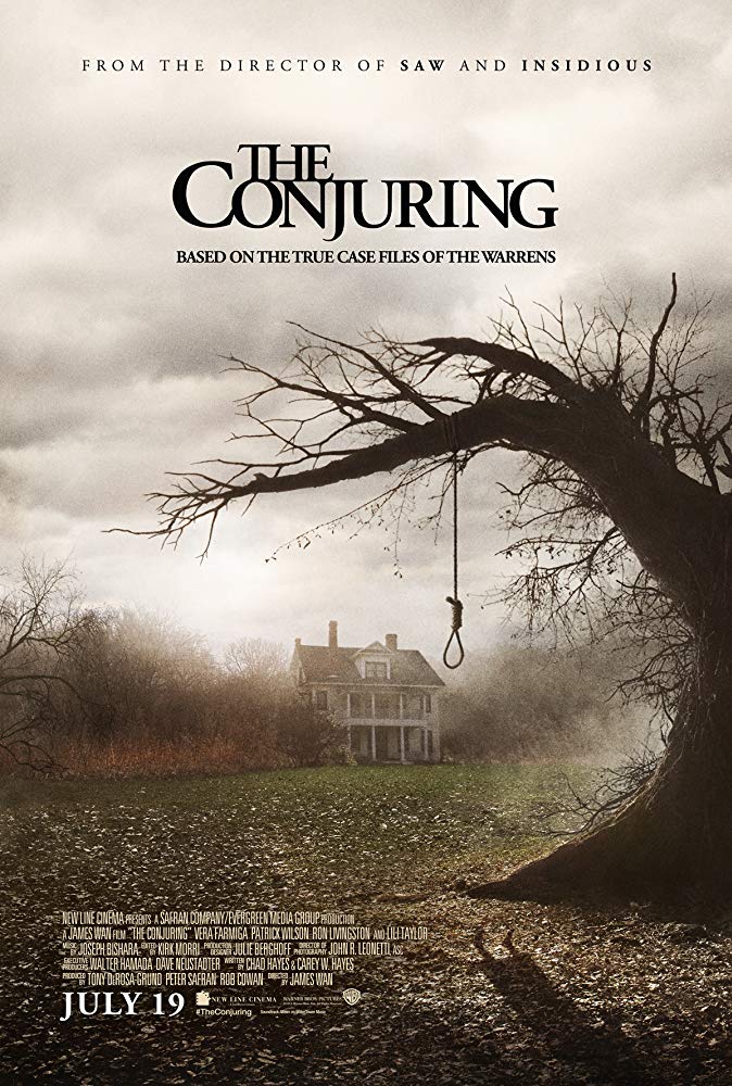
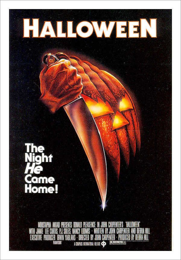
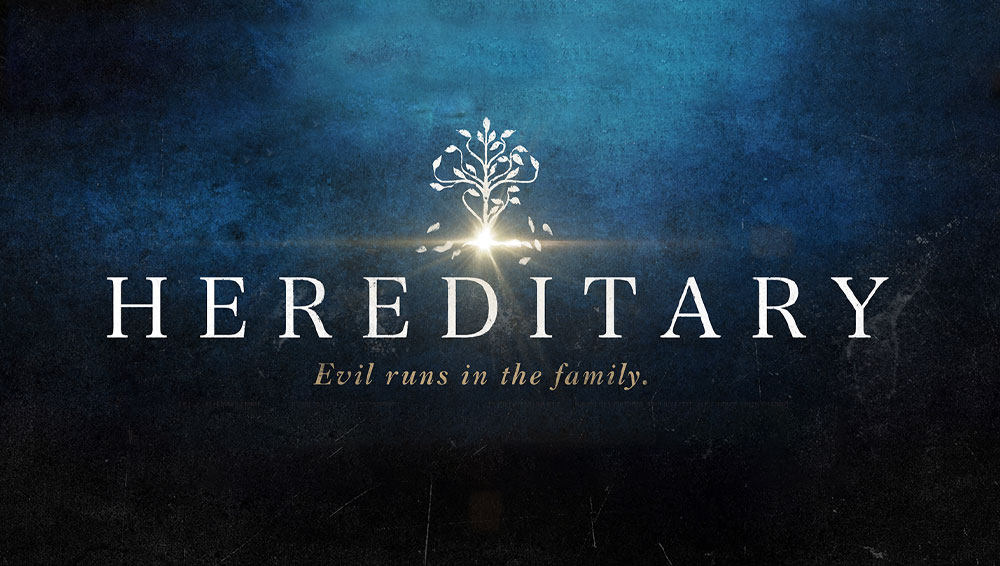
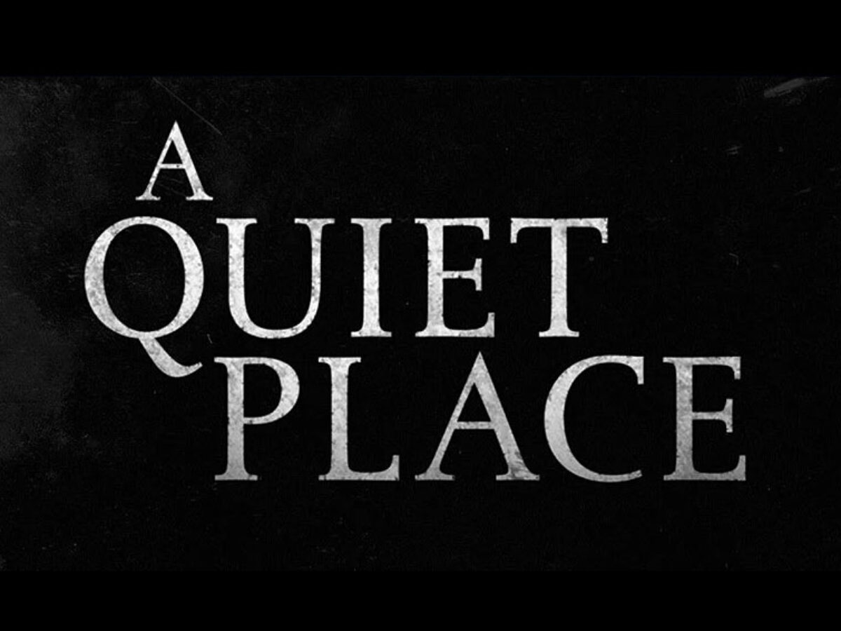
I have begun to develop some ideas on how I will give credits in the film opening and present the title of the film. In doing so I had to research the topic of fonts, and which ones would fit the best for the text that is going to be used in the film opening. I have researched some movies which are very popular and use fonts that make the title pop out. For example The Conjuring, Halloween, Hereditary, and A Quiet Place.


The Conjuring as a whole film opening has been very inspiring to me, such as Halloween has, but what else has inspired me is the font that both of these film openings used to present the title of the film and the opening credits. The font and the film complemented each other wonderfully and I believe if any other font was used then it would have ruined the opening credits and made it dysfunctional. The font style which The Conjuring uses is called Adobe Garamond Typeface, this font is globally known to be The Conjuring film. This font is very recognizable by people and has made a dramatic impact and has such a big influence on the title of the film. The same goes for the movie Halloween, the director decided to use ITC Serif Gothic Heavy. The font of the movie fits perfectly back in its time and era, this font has become a part of the film and just like The Conjuring, this font is recognizable by many people. Other fonts which in my opinion blend well with their films is A Quiet Place and Hereditary. A Quiet Place is a movie about having to be quiet for survival and the font just compliments that aspect of being quiet but still bold. The font which was used was Albertina, this font truly just creates that perfect title looks for the movie. Hereditary is a movie in which a matriarch of the family dies her daughter and grandchildren begin to figure out horrific secrets about their family and try to outrun the sinfulness in the family. I felt that the font Hirango Serif was a great choice as it truly makes the title and the opening credits seem as if they have history and meaning behind it. It complements the movie very well and I don't believe any other font would have done better.
After researching and putting a great amount of time into the font, I have realized that it is a very big deal which font the director uses because it has to fit the theme of the film or story. This has a huge impact because no font can just be placed in the film opening or else it will just look out of place, and if the font is good enough it can actually cause the film to have huge popularity as many people will recognize the font of the film on other products. The lesson that I learned was that font is criminally underrated and very looked over, and many people may just look over it as a bunch of letters. The reality is that font either sets the tone of the film or destroys the film's theme entirely.
This research has really opened my eyes to how significant the fonts have to be in order to capture that theme and present the title as perfectly as you want it. I will continue to further research what font will fit my horror film opening the best, but it also depends on if I will choose slasher or supernatural. I will continue to blog about my journey and I notify everyone if there are any changes. Bye everyone I hope you all have a great day and see you all on the next blog.
No comments:
Post a Comment